
Increasing user engagement with a new point of entry of the SaaS platform
Context
FinCompare is a comparison portal, offering small and medium-sized businesses access to loans and financial solutions. Its main product is a platform where sales agents manage customers' financing applications. My role was to ensure the platform is intuitive and enjoyable, empowering financial advisors to work smarter and with confidence.
Problem
After transitioning from an internal tool to a SaaS platform for external financial advisors, the company saw lower-than-expected engagement from new users. Many struggled to navigate the system, leading to incomplete applications and frequent support calls.
Solution
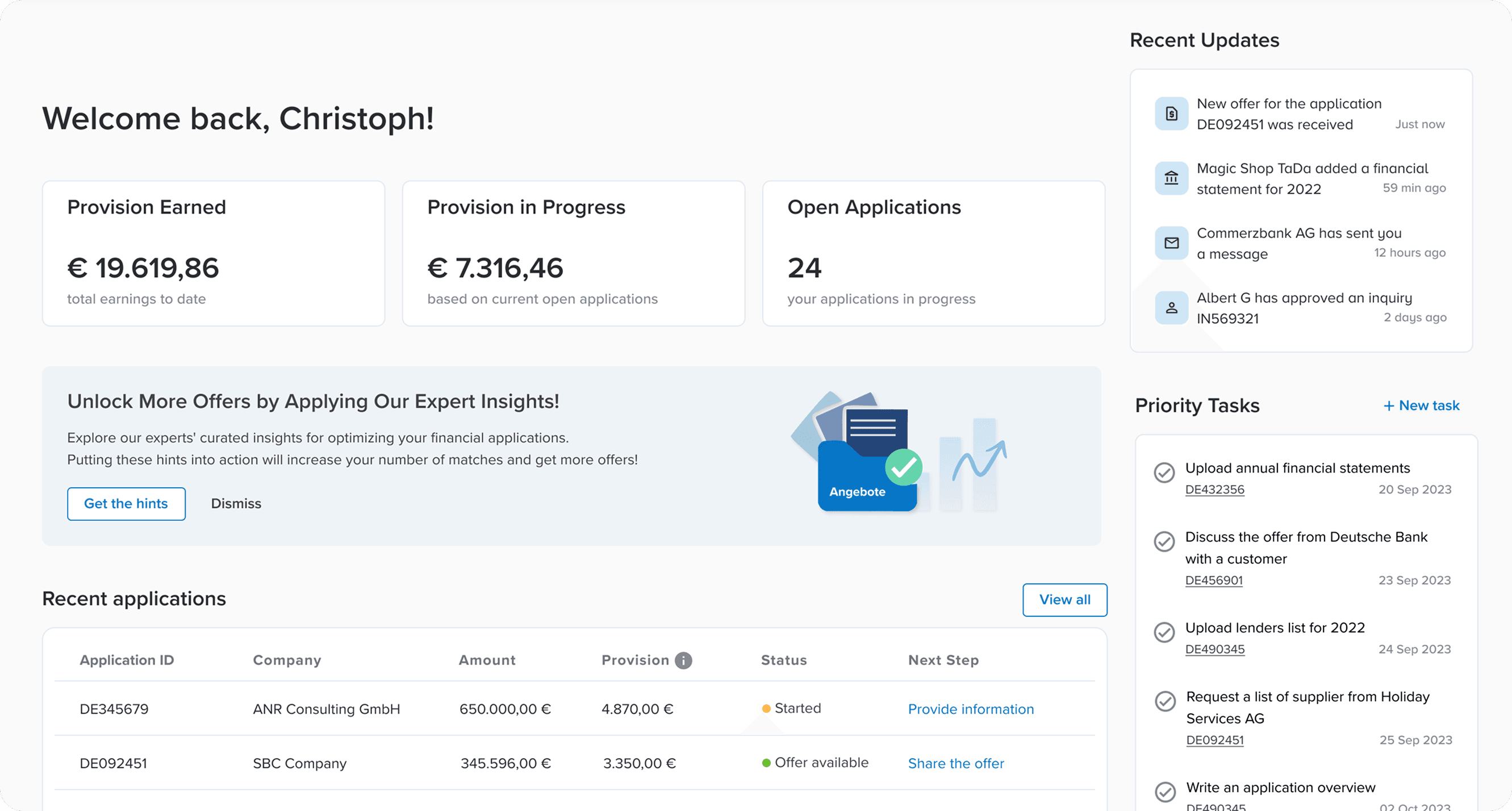
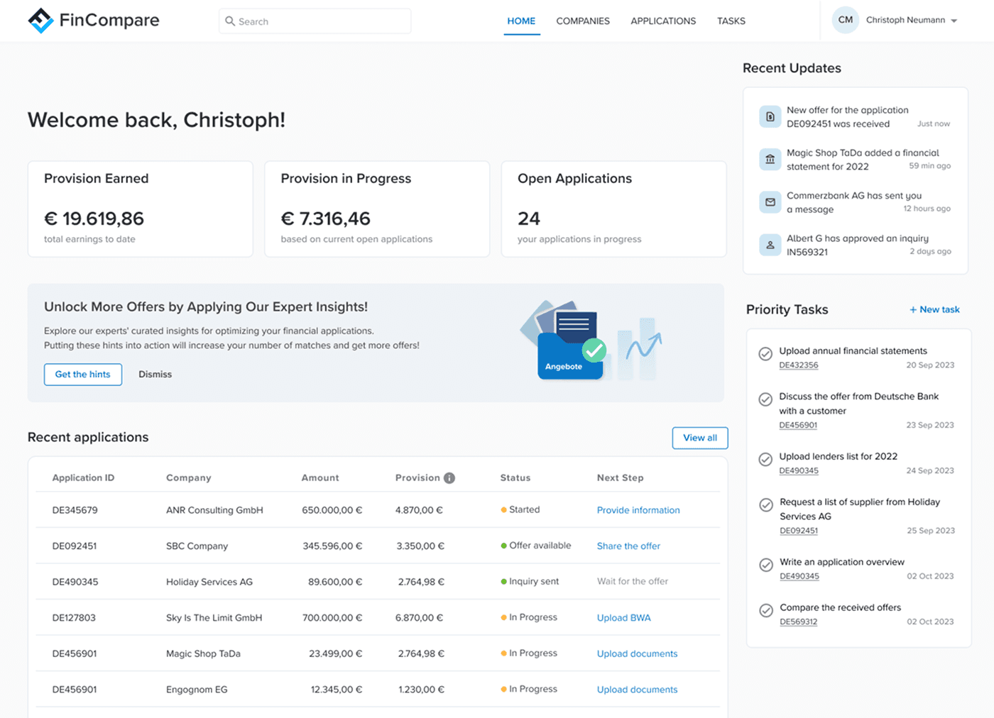
I led a redesign of the platform’s entry point to make the experience intuitive and motivating. The new design highlighted potential income, surfaced incomplete tasks, and clarified application statuses to guide users toward action.
Challenges
Simplifying complex financial workflows without compromising functionality
Aligning diverse user needs across internal teams and external advisor
Getting stakeholder buy-in on a new, streamlined approach
Iterating through user research and testing to ensure clarity and trust
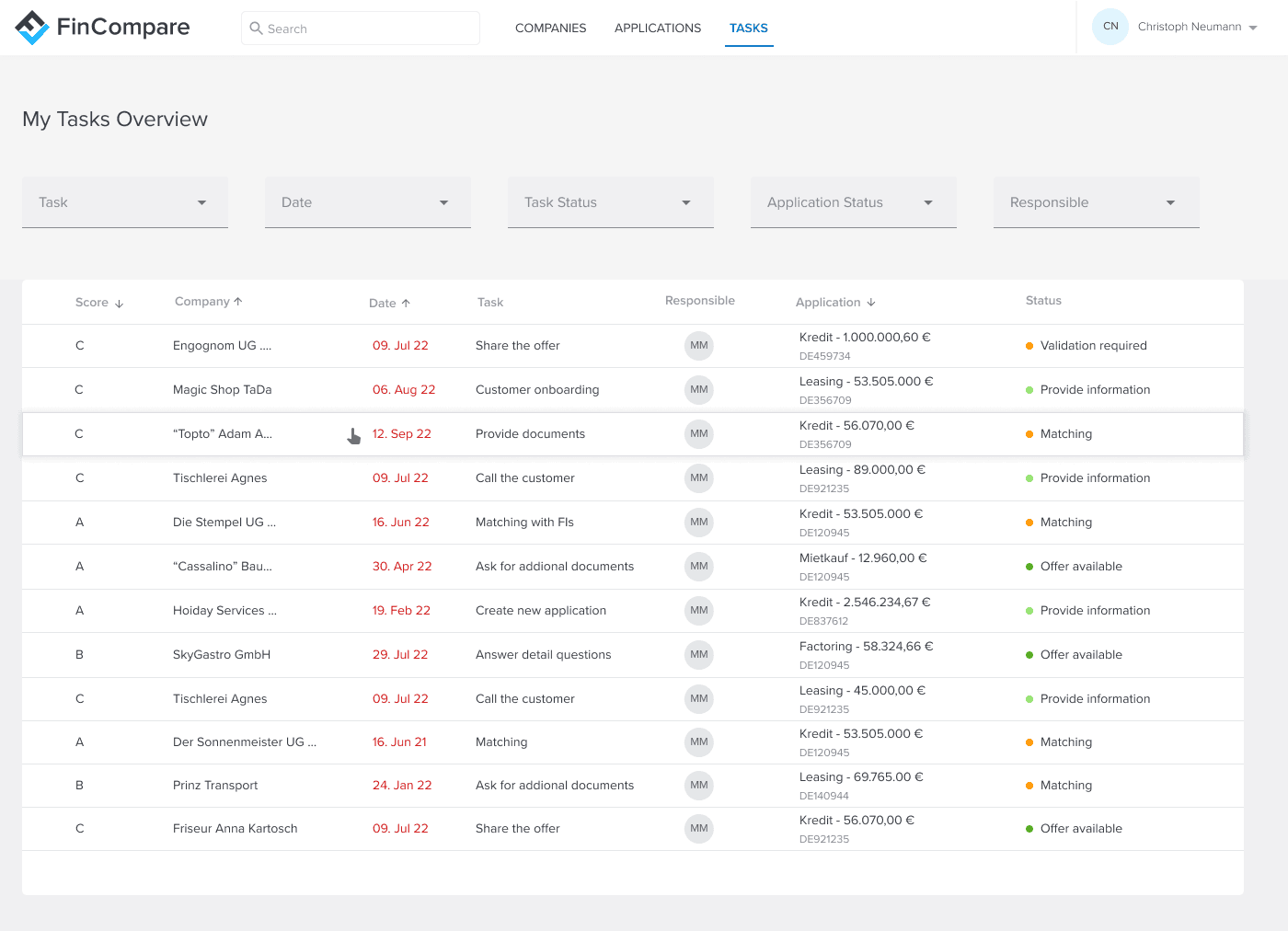
Before & After
I led a redesign of the platform’s entry point to make the experience intuitive and motivating. The new design highlighted potential income, surfaced incomplete tasks, and clarified application statuses to guide users toward action.
Have a closer look
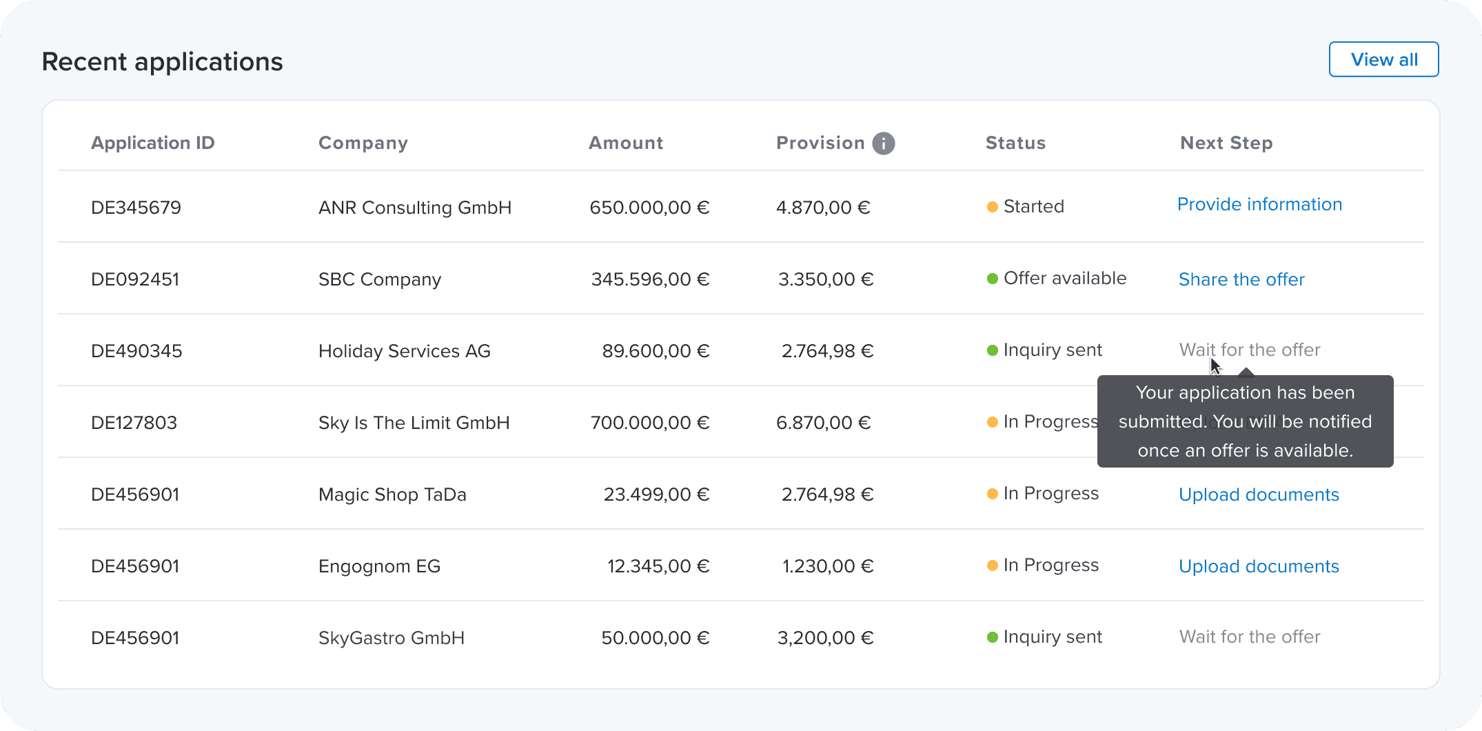
Clear Status and Next Steps
This section highlights recent applications with clear status indicators and direct links to required actions reduces the steps needed to reach key tasks.
Transparent Income and Revenue
New financial widgets are meant to help users see the value of their partnership with the platform and motivate them based on their financial performance.

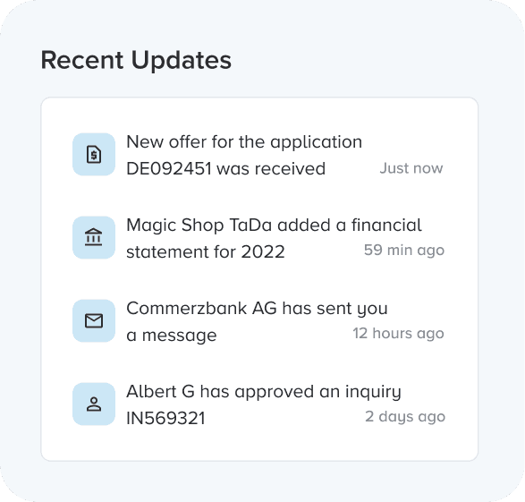
Recent Updates
A notifications section with a quick overview of all changes since the user's last visit, is aiming to save time provide users with a valued information.
Prioritized tasks
Tasks section now highlights deadlines and provides links to applications that brings users directly where action is required.

Empowering Users with Knowledge
Added a section linking to the help center, offering articles that enhance users’ knowledge in SME financing, fostering independence and confidence.

Outcomes... or metrics I'd liked to track
Due to internal company factors, this project was not shipped. However, had the redesign been released, here are the key metrics I would measure:
Task completion rate
Drop-off rate
Heatmaps and click maps
Time from the first step to the final step
These metrics would have provided valuable insights into user engagement, task efficiency, and overall usability improvements of the redesign.